


3 Charts for Bear Markets

The common refrain during bear markets (for good reason) is to stay the course and think about the long run. Far easier said than done. While this is sound advice, it's helpful to understand the data that supports it. In the midst of bear markets, I consistently turn to these charts to provide a historical context and reinforce my decision to stay the course.
Bear Market Mentality
The S&P 500 Index, representing large U.S. company stocks, officially entered a bear market on Monday, June 13th, as it fell over 20% from the all-time high marked on January 3rd. Since entering a bear market, the index has bounced around but remains down about 20% in 2022.
Checking your investment account balances at this point in 2022 (and in any bear market) may result in a pit in your stomach and an urge to do something. As this feeling begins to overwhelm us, we are counseled to focus on our long-term goals and stay the course. While this is generally excellent advice, it's helpful to understand the "why" behind this advice.
Even more helpful is to have a playbook to review during bear markets. Below are three pieces of data that I turn to for reinforcement during these challenging moments.
Chart 1:Historical Drawdowns and Returns
The first chart provides a historical context for stock market drawdowns and returns. The chart below shows S&P 500 calendar year drawdowns (red dots) and returns (gray bars) since 1980.

Drawdowns are peak-to-trough declines in the market. For example, during 1980 the market fell 17% from its high during the year. In 2020, the market fell 34% in February and March in the early stages of the COVID pandemic. And in 2022, the market has declined 24% from its all-time high set on January 3rd.
The returns (represented by the gray bars) are for the full calendar year. In 1980 the S&P 500 Index ended up 26%, 16% in 2020, and the index has declined 21% through June 30th in 2022.
Since 1980, the average drawdown for the S&P each calendar year has been 14%. But despite these drawdowns, the market has averaged an annual return of 9.4% during this period.
As I review this chart during a downturn, I acknowledge the market could go lower from here. However, the market has already declined more significantly than average and if I tried to time the market at this point, I would be betting on two things: (1) the market is going to experience an even greater drawdown and (2) I will know when we reach that bottom and take action then.
I'm not confident in either of those points. Historically speaking, what seems like a more likely scenario is I will look back on this moment in a couple of years and see this as an incredible buying opportunity.
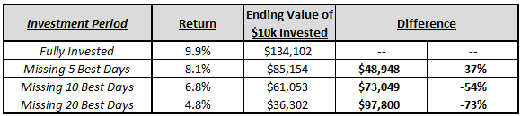
Chart 2: The Cost of Missing the Market’s Best Days
To further strengthen my resolve, I also reflect on the cost of missing out on the market’s best days. You may have heard stories of investors bailing out of the market at precisely the wrong time or how, on average, investors in mutual funds underperform the funds they are invested in. I don't want to be part of those statistics.

This chart compares the annual returns of investors in Vanguard’s S&P 500 Index Fund (VFINX) since 1995 if they were fully invested, compared to missing out a several of the market's best days.
Since 1995 there have been 6,924 trading days. If you missed out on just the five best days, your annualized returns would drop nearly two full percentage points, from 9.9% per year to 8.1%. Missing out on the 20 best days would have cut your annualized returns by more than half.
What does this mean in dollars? If you had $10,000 fully invested since 1995 (27.5 years), at 9.9% per year you would have grown your investment to over $134,000. Missing out on the five best days your investment would have grown to $85,000, 37% less than being fully invested.
 And when do these best days occur? Amidst the worst markets.
Chart 3: The Market's Best Days
The final chart to help me stay the course takes a look at when the market’s best days have occurred.

The above chart lists the best days for an S&P 500 Index Fund (VFINX) since 1995. These days have occurred right in the thick of the worst markets of the last 25 years and include the initial rallies coming off the 2009, 2018, and 2020 lows.
A bear market is always uncomfortable. But, after already participating in this market, the last thing I want to do is realize my losses and risk missing out on some of the market's best returns.
Putting It All Together
So halfway through 2022 the S&P 500 is 24% off all-time highs and, if you are paying attention to financial media, the future is bleak.
However, by reviewing these charts we can reflect upon the following:
- The market has already fallen greater than average and has very rarely fallen much further from these levels
- Missing the market’s best days can be incredibly detrimental to long-term returns and outcomes
- The market’s best days have often occurred in the ugliest markets, or shortly thereafter
These facts help me to stay the course during these tremendously uncertain and uncomfortable times. As you continue your investment journey, I'd encourage you to have a few data points, articles, or books to turn to when we hit periods of volatility (which we know will occur).
Lastly, while making a change to your investment portfolio at this point is likely ill-advised, there are a few things to consider to try to make the most of a bear market.